Introduction
Since 1919, Northeastern Oklahoma A&M College has been a beacon of higher learning. Established to meet the needs of a booming mining industry, NEO is an institution focused on comprehensive education. Through the years, the brand identity at NEO has been fluid, and it was not until the renaming of the Miami School of Mines to the Northeastern Oklahoma Junior College and later Northeastern Oklahoma A&M College that a brand began to develop.
NEO is organized as a state-supported comprehensive college offering associate degrees and/or certificates while remaining sensitive to the specialized educational needs of the local community. The basic curricula contain first- and second-year courses for students who intend to pursue a baccalaureate degree after leaving Northeastern Oklahoma A&M College. Occupational programs provide opportunities for those who plan to enter the workforce upon graduation. Other educational programs provide for furthering the cultural, occupational, recreational, and enrichment opportunities for those in the community desiring to study, with or without credit, in specific areas of their interest.
This branding guide is to be used as a reference in the creation and distribution of a variety of media by NEO’s partners, suppliers, staff, and faculty members. All marks and logos are the property of NEO A&M College. Unauthorized use is strictly prohibited. Only NEO faculty and staff may download assets, and their use is restricted to college business in accordance with brand guidelines. Individual students may use NEO marks on presentations and research posters. Authorized agencies and designers may be granted usage privileges while working on NEO projects. For licensing, contact the NEO Marketing & Communications office.
Primary Identity
NEO Seal
The NEO seal is the official representation of our institution to the Oklahoma State Regents for Higher Education. The seal features “Northeastern Oklahoma A&M College” in NEO Blue on the top hemisphere, followed by “Miami, Oklahoma” on the lower hemisphere. Inside the inner circle, the NEO chimes stand surrounded by a rolling cloud in NEO Yellow. The phrase “Preparing for Tomorrow” is written on the inside of the inner circle. Alternatively, the logo may be displayed in only NEO Blue.
NEO Slant Logos


The NEO slant logo is an important part of the NEO brand and is often used to represent our institution to the general public. The primary version includes “A&M College” beneath to identify NEO as an institution of higher learning. The simplified slant logo is useful in design situations that require minimalism or when space and size are a constraint.
NEO Odin Logo
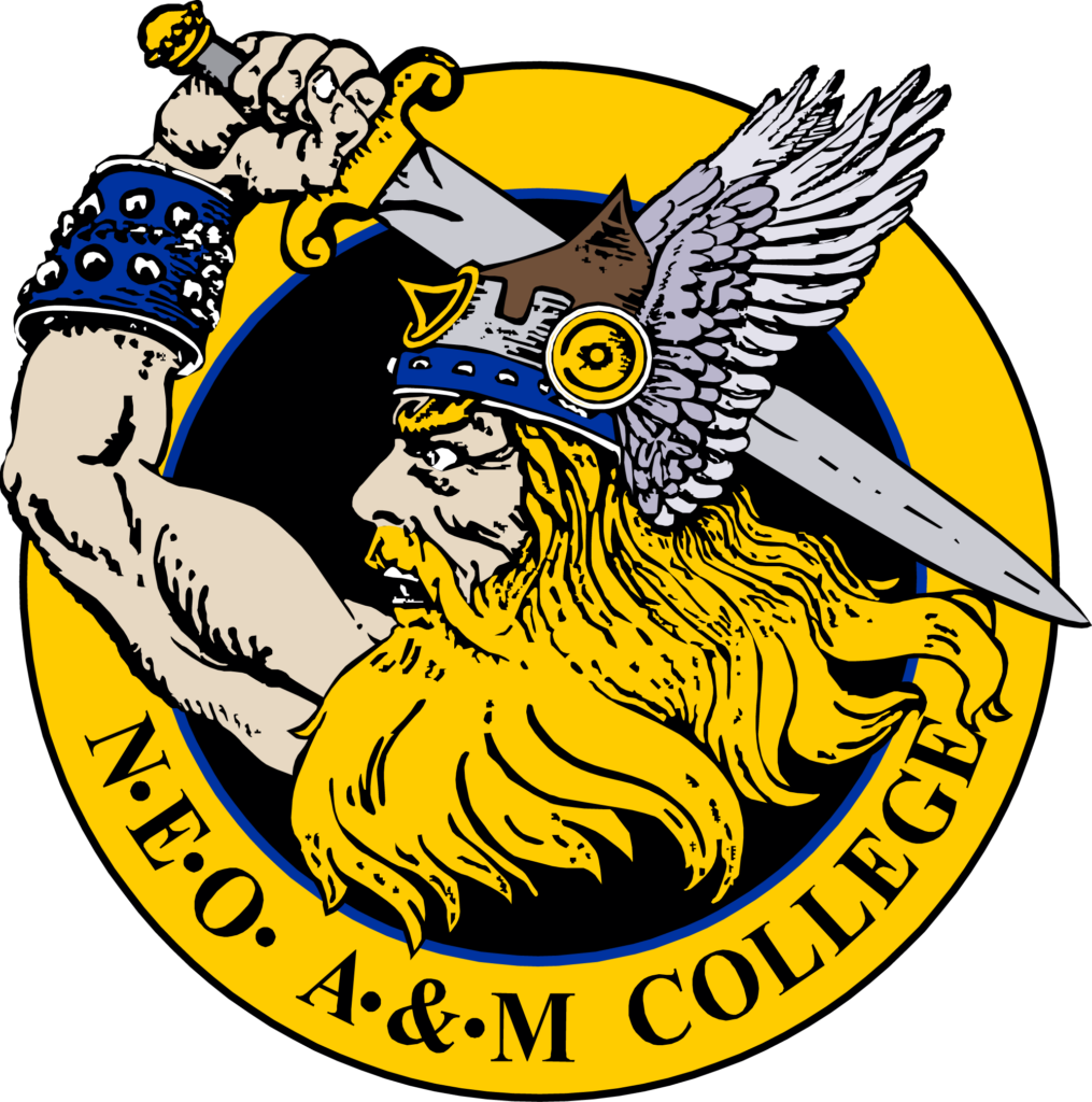
In 1933, NEO held a contest seeking a new mascot as the school continued to grow. President John Holcomb selected Gilbert Reynolds’ “Norsemen” as the winning submission. As great explorers of the North, these figures were associated with bravery, cunning, and strength. The name “Norse” or north was also seen as a fitting tribute to NEO’s location in Oklahoma. The Norsemen identity was popularized by Coach “Red” Robertson in 1945, as he sought to enhance the NEO brand. Robertson worked with renowned artist and former NEO Art Department Chair Charles Banks Wilson to design the logo that now serves as the primary athletic identity for NEO: The Odin Logo. The logo features Odin, a chief Norse god, holding a sword above his head and wearing a winged helmet. In all branding, excluding explicit allowance by administration, the representation of Odin must not be changed in any way.
NEO Agriculture Brand

Following Northeastern Oklahoma Junior College joining the Agriculture and Mechanical Colleges System in 1945, Dr. Bruce Carter was dedicated to ensuring that NEO Agriculture would become one of the greatest programs in the country. Beginning with the purchase of the NEO College Farm, later renamed Synar Farm, NEO Agriculture has developed into a widespread system of research farms, arenas, classrooms, and barns.
To further heighten the prestige of NEO Agriculture and to set it apart from other programs throughout the country, NEO developed a “Brand” to use both for practical purposes with steer leased to NEO and for design purposes to instill an “Aggie” feel. The NEO “Brand” is a variant on the “Slant NEO” logo with slight changes to the “N” and “O,” but with the spine removed from the “E.” In addition to the “Brand,” text included below often denotes specific departments or programs that use the logo.
NEO Colors
The two primary colors in the NEO palette are Blue and Yellow. These two colors represent NEO in nearly all design elements, including academically, athletically, and in co-curricular activities. Aside from the NEO badge, Blue and Yellow are the most recognizable design elements for NEO. However, these two colors are complimented by secondary colors that can be arranged and combined in different ways, depending on design requirements. The NEO palette includes white, Black, and Grey as neutrals. The design colors create a variety of options for implementing the NEO logos and primary colors while still providing consistency.

HEX: #0033A0
RGB: 0, 51, 160
CMYK: 100, 68, 0 37

HEX: #FFCA00
RGB: 255, 202, 0
CMYK: 0, 21, 100, 0

Black
Grey
Hex: #C2C4C6
RGB: 199, 200, 202
CMYK: 0, 0, 0, 25
Proper Use
Spacing Guidelines
Proper space should be given to the logos to not crowd or constrain them. The cases of spacing are presented above. While minor variations may be made, the Badge logo should be given clearance of 1/5 its total height, the wordmark 1/2 its total height, and the Slant NEO logo 1/4 its total height.
The logos should not be incorporated into another logo or broken apart unless specifically arranged through the NEO Marketing & Communications Office.
The NEO Seal is not to be used in promotional material and is reserved for use by the Office of the President.
Color Guidelines
All forms of NEO logos must be used with proper colors, and the logos themselves should not deviate. The backgrounds may have different colors, but proper inversion must be applied to light colors. (Ex. The blue NEO Badge should be used on a light grey background instead of a white Badge.)
Any questions regarding the proper spacing or coloration of NEO logos should be directed to the NEO Marketing & Communications Office.
Discontinued Logos
The logos below are previous iterations that are no longer used by NEO A&M College. Please do not use this logo in any way. For updated logo files, visit the Resources page or contact NEO Marketing & Communications.

Typography
Montserrat
Montserrat is the primary sans serif typeface for NEO A&M College. The Montserrat font family is versatile, with various weights for many applications. Montserrat can be downloaded from Google Fonts.
Georgia Pro
Georgia Pro is the primary serif typeface for NEO A&M College. Georgia Pro’s readability and diverse font family make it ideal for both text and display. Georgia Pro is available through Adobe TypeKit.
Bodoni Moda
Bodoni Moda is a secondary serif typeface for NEO A&M College used in the NEO Update magazine. Bodoni Moda is available from Google Fonts.
Proxima Nova
Proxima Nova is a secondary sans serif typeface for NEO A&M College used in the NEO Update magazine and on the NEO website. Proxima Nova is available through Adobe TypeKit.

Contact NEO Marketing & Communications
- neocommunications@NEO.edu
- 918-540-6211
- Dyer Hall